The Valuator
Your Guide To Disciplined Investing & Trading
See the videos
Watch-list Candidates & Values
Fundamental & Technical Measurements
Notice. We provide information in The Valuator that will enable a person to create lists of stocks that have “persistent strength” and facilitate investment discipline. A subscriber can go through lists of these “strength” stocks looking for the setups illustrated on the “Stock Alerts” page of our Website. The key is to become so familiar with the setup configurations illustrated on that page that you can spot them at a glance. By starting with a list of stocks that have “persistent strength,” you are automatically focusing on stocks with strong positive momentum (a positive bias). Combine that with a “setup” configuration and a “trigger event” and you have a high probability positive outcome.
The “enhanced” version described below is free to subscribers
Other Details
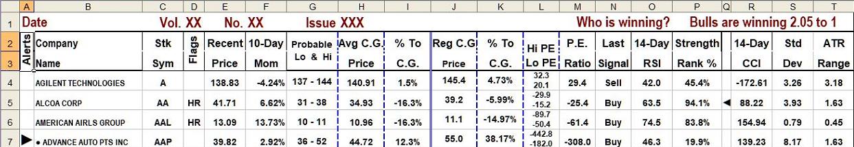
> the 10-day Momentum is included for each stock,
> We include the % advance or decline needed for a stock to reach its Center of Gravity,
> the “Center of Gravity” is indicated for each stock,
> Note: The “Strength rank listed above is the “Persistent Strength” rank This is far different from the 14-day RSI with which you have to wonder if the stock is about to collapse at any minute. While a stock with “persistent strength” may decline at any time, it has a much higher probability of continuing to advance. Therefore it tends to be more likely that a person can gain by “hopping on and going for a ride.”
> the Standard Deviation given is based on data accumulated over the last 50 days
> The ATR mentioned above is Wilder’s 14-day Average True Range (ATR).
“Fair Value” and “Center of Gravity”
People buy high and sell low because at any given time they have no rationale for judging where a stock is relative to its “fair value.” The price of each stock swings up and down between being “overvalued” and “undervalued” relative to ANY measure of the underlying value (the “fair value”) of the stock. The market’s concept of “fair value” for a stock is not constant. “Fair value” is what the market thinks it is at the time. Like it or not, “fair value” is tied to market sentiment. People use various measurements and ratios to express “fair value” and those metrics give a sense that fair value is something that can be quantified. However, “fair value” always has a context that in some way shapes its meaning.
For example, one year a company may generate earnings of $2 a share. During that year, the price of the stock ranges between $30 and $40. Another year the stock generates earnings of $4 a share (it doubles). During that year, the stock’s price may range between $25 and $30 or between $40 and $50. If you have watched the market for any length of time, you will know that this kind of thing is common. The same thing occurs if your “fair value” measurement is based on book value, PE ratios, price-per-sales ratios, PEG ratios, dividends, earnings yield, or whatever. “Fair value” is what the market says it is. It is always changing with the successes and failures of the company (or sector) and in accordance with how people judge those successes and failures (sentiment). New healthcare legislation is passed and the value that the market places on healthcare stocks changes. Also, the “fair value” of $1 in earnings generated by a tobacco company was different in 1950 from what it is now. “Fair value” of the same amount of earnings changes over time. Also, the fair value of $1 in earnings generated by a tobacco company is different today from the fair value of $1 in earnings generated by a computer chip company today (the same earnings varies in value, depending on who generates the earnings). Why not find a better measurement of “fair value?”
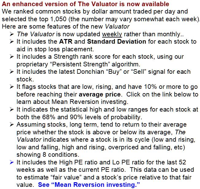
With regard to earnings estimates, a study of more than 67,000 estimates conducted by David Dreman determined that 45.3% of analyst’s estimates missed actual earnings by more than 15%. However, that 15% variance is bi-directional. That is, one stock analyst may estimate 15% more than the actual figure turns out to be and another, looking at the same stock, may estimate 15% less. The measurements you use may vary by 30% from the measurements used by someone else. You may be reaching entirely different conclusions about the same stock depending on which analyst you are using. While we provide some analyst-generated measurements (PE ratios are based on earnings for the previous 12 months), we now use Center of Gravity as a reference point for the probable short-term price target for the stock. Long-term, actual earnings (not analyst estimates) and sentiment will determine actual long-term pricing. We have two methods of determining “Center of Gravity.” Whether a stock is rising or falling, it will tend to occasionally return to its 50-day moving average. 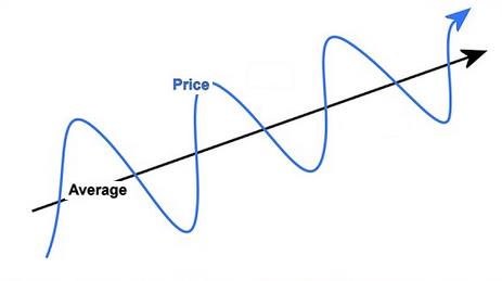 the 50-day moving average is a favorite of professional investors and traders. Stocks tend to swing above and below this average over time. This average can therefore be considered to be the short-term “price of highest probability.” Short-term, we consider it to be more useful than analyst estimates. Analyst estimates, besides being often inaccurate, by the time you see them they can be 3 months to 6 months old. We also use linear regression as a means of defining “Center of Gravity.” Here is a graph showing a regression line for a scattering of points (for example, the closing price of a stock over a period of time.
On comparing regression analysis with the 50-day moving average as tools determining Center of Gravity, we found that the number of times, over a long period of time, that a stock is enough below the C.G. to give a reasonable profit on return to the C.G., averages out nearly the same for either approach. We flag stocks that have positive momentum and can rise 6% or more before reaching their C.G. We also flag stocks that have positive momentum and can rise 10% or more before reaching their C.G. We use different flags for referring to the 50-day moving average based C.G. and for referring to the linear regression based C.G. That way, a subscriber can use either method or both. However, stocks do not necessarily deviate 6% or 10% from their Center of Gravity for both approaches at the same time. Therefore, using both approaches can provide the subscriber with more possible candidates for investment.
Instead of thinking in terms of “undervalued” and “overvalued” relative to “fair value,” we think in terms of “underpriced” and “overpriced” relative to the “price of highest probability.” We can look at the average price as the “price of highest probability” or “Center of Gravity” for the stock. Prices tend to return to the mean (average). They also tend to return to their regression line. That they will return to their C.G. is a “guess” just as earnings estimates are based on guesses. However, our data for the C.G. (as determined by either method) and other data in The Valuator are current at the time of publication, not up to 6 months old. For more on “Center of Gravity,” go Here. For more on “Return To The Mean” investing, go Here
The Need For A Discipline
You cannot monitor all stocks. Therefore you must focus. Develop strategies, systems, and disciplines that will enable you to find “setup” situations. Develop a discipline for finding stocks that are attractive and timely technically.
The Valuator is a resource and research tool for traders and investors that is specifically designed to enable its users to develop a disciplined approach to investing. It is also intended to be useful in the implementation of that discipline. Implementation of a disciplined approach to investing requires regular follow-up information on stocks that have been selected for inclusion in a portfolio. That is why a relatively large and stable list of stocks is monitored. The Valuator is a publication that, at this writing, tracks approximately 1,050 stocks on a regular basis (the typical market newsletter covers only a handful of stocks with almost no follow-up reporting). Our general policy is to continue tracking a stock until we deem it necessary to drop it (because it has been de-listed, absorbed in a merger, or for some other reason).
The Valuator is different not only in the quantity and quality of data it provides (it is accurate and current rather than the guesswork of analysts), but also in the fact that its data can easily be sorted and sifted by users. Sorting and sifting should make it easy to find the stocks that best satisfy the particular requirements of your discipline. You also have our permission to print your own hard copy.
Basic Facts You Should Know
Investors often get their ideas through the media from “gurus” who are being interviewed. Those stock recommendations may have been great when first conceived, but by the time the would-be investor hears about them, it may be too late in the game for an individual with limited resources to take an initial position. For example, the money manager touting a stock on a television investment program may have been buying his “best pick” for several months (buying most of it when the stock was fifteen dollars cheaper), or the stock idea in Forbes magazine may have originated weeks before publication. As a consequence, people who buy into these recommendations are buying late, perhaps even buying when the “guru” who recommended them is already selling or making plans to sell his positions.
In view of how inaccurate and untimely analyst earnings estimates tend to be, we no longer base investment decisions on their reports. Instead, we look at the pattern of movement of a stock. These measurements are both extremely accurate and timely. For an illustration of what we mean, think of a trampoline. Imagine looking at it, aligning your eyes with the edge of the frame that holds the canvass with springs placed around the inside of the perimeter. From the side, the frame forms a straight horizontal line. Now imagine a person jumping on the trampoline. His feet push the canvas below the frame, and when he bounces, his feet rise above the frame. Now imagine the pattern of his feet only. They oscillate above and below the straight line of the frame as viewed from the side. A stock’s pattern is similar, in that the price will oscillate above and below its average, the focal point of its oscillations. The moving average is, by definition, the average price of all its variations, and the price to which the stock is likely to return with the highest level of probability. The “oscillations” are not evenly spaced. They are irregular, and sometimes a stock will stay a fairly long time on one side or another of its average. (Just as, for extended time intervals, a stock may stay above or below its estimated “fair value” as determined by the earnings estimates of an analyst). However, we think the statistical pattern of variation in a stock’s movement is a more reliable basis for our expectations than the outdated ruminations of an analyst. Now, look at this chart. Bear in mind that with either approach, a stock may never return to its estimated “fair value” or its long term average Price. A company’s stock may be flying high because the company has a found a cure for cancer, but when it is discovered that it causes rapid aging and early death, the stock may plummet and never recover. Analyst estimates and the long term average price both can become irrelevant.
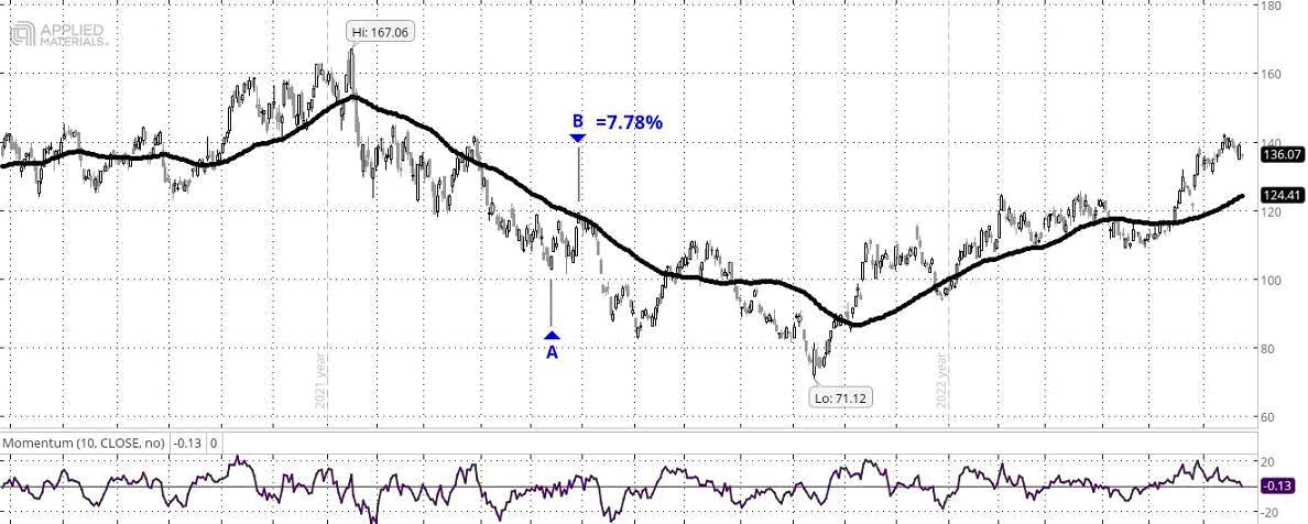
This illustrates what we mean by a stock “swinging above and below its average.” Here, the Center of Gravity is the 50-day moving average (see Mean Reversion strategies). [NOTE: We could have used the 200-day moving average, but if we did, there would be far fewer cycles of opportunity. The tradeoff is that some potential gains, but not all, will be smaller.] We call the central tendency of price distribution about the mean its “Center of Gravity” or “C.G.” Notice that the 50-day moving average is in a steep decline. At “A” the stock had 13.7% to go to reach the C.G. (50-day moving average). However, because the moving average was in a steep decline, buying at “A” and selling at “B” resulted in a gain of 7.78% in 7 days. That return, though not the 13.7% potential originally indicated, is not too bad for buying into a falling stock in a falling market. The chart illustrates what we mean by “oscillates.” Sometimes it is below the heavy black line and sometimes it is above that line. Wherever it is, it tends to eventually return to that line. Note also that we did not highlight the greatest gain possible on the chart. The dark line at the bottom of the chart is the 10-day momentum. When a stock has been declining and is below its 50-day moving average, momentum will normally be negative. We suggest that one requirement before buying any stock is that the momentum not still be negative. Look at the bottom dark line below point “A.” It is moving sideways. While it is still negative, the pattern is is not still declining. However, the ideal is for the momentum to be positive. The alerts in the left margin of The Valuator will highlight such stocks. Using the data in the % to C.G. column, you can limit your interests to stocks that are 15% or more below their C.G. Just be sure its momentum (probably below the zero line in a chart) is not still declining before considering a purchase. If it is still declining, either wait or go elsewhere. Your “watchlist” has over 1,000 stocks. You won’t have to wait long for another candidate.
Another pattern to be aware of is that in a strong trend, the stock tends to reverse when it is at or near the heavy black line. This is very common when there is a strong trend in either direction. If a stock has a strongly rising 50-day moving average and it declines to that average, wait until the high of the day is higher than the high of the previous day. This will be an indication of new buyers taking a position in the stock. It is likely that the stock will rebound and rise again. You can see this in the right half of the above chart.
As the premium above the C.G. increases, the probability of a decline increases. However, as the stock rises, so does its average. An investor can often “ride” a strongly rising 50-day moving average through several (and sometimes many) cycles. if a person uses a stop loss to follow the stock up, then a sale near the high when the stock begins to decline can lock in a profit and free up money that can then be re-invested elsewhere, or even later in the same stock.
If a stock is below its C.G., The Valuator shows in the “% TO C.G.” column the gross profit potential of the stock if it is bought at the “Recent Price” below the C.G. and sold at the “C.G.” While there is no guarantee that it will actually reach the “C.G.” price, the probability is that it will eventually do so. Just as there is no guarantee that a stock will reach its “fair value” based on analyst estimates. The difference is that the data in The Valuator is based on the actual and recent activity of the stock (and on statistical probabilities) rather than on estimates and guesses about future earnings.
How Can You Use The Center of Gravity?
The distance between a stock’s current price and its C.G. is its theoretical profit potential if the stock is below its C.G. Stocks will sometimes stop rising at their C.G., but they often rise above it (if it is not in a strong negative trend), sometimes doubling its theoretical profit potential. Even declining stocks that are below their C.G. will tend to gravitate to their C.G.. However, simply buying a stock when it is well below its C.G. can be dangerous, because the stock may still be in a declining trend. Therefore, if the stock is below its C.G., you want the stock to be rising before taking a position, or at least give an indication that it is no longer declining. The Valuator flags stocks that are 6% or more below their C.G. A different flag is displayed for those that are 10% or more below their C.G. The left hand margin will display a “♦” if the profit potential is between 6% and 10% AND, at the same time, its 10-day momentum is positive. It will display a “►” if the profit potential is 10% or more AND, at the same time, the 10-day momentum is positive. We use the 10-day momentum because its sensitivity will result in an early warning if the uptrend changes to a downtrend. If the momentum starts to decline, that can serve as your sell signal. Since the 10-day momentum is updated each week, you can monitor the momentum to see if it is decreasing and by how much, etc. Alternatively, you can chart the 10-day momentum yourself for daily monitoring. Just be aware that some fluctuation is normal.
We have already said that we made the change from using “Fair Value” based on analyst earnings guesses as our target price to “Center of Gravity” because analysts are so often way off the mark in their estimates. Also, their data is usually updated on a quarterly basis. So the analyst’s earnings estimate available may be nearly three months old, and depending on the publishing date, it may be older. Therefore, we saw a two-fold problem in using the concept of “Fair Value.” It was often inaccurate, and it was often based on old data. The C.G. is not based on the subjective opinion of an analyst. It is precise and current. It is based on the actual behavior of the stocks being tracked, not on guesses. Since a stock’s chart pattern reflects all that is currently “known,” we think the pattern is also more reliable as an indicator of its own probable behavior.
Let us illustrate the problem. Assume that you are subscribing to one of the finest and most comprehensive publications available for stock investors (we will leave it unnamed but you can probably guess the name of the publication). It tracks about 1700 stocks and provides a huge amount of data. Each week, it sends subscribers reports covering about 130 of the stocks it tracks, and it takes about 13 weeks to get a complete set of reports. Suppose the analyst last updated his data three months ago and the market letter covers that stock just before the analyst sends in his updated report. By the time the market letter updates that stock again with his report, it could be as much as another 13 weeks old. That means the data for some of the stocks could be 90 days old + the additional 13 weeks or as much as 181 days old. Compare that with The Valuator where data is updated weekly, for all stocks tracked, and that is current on the day of publication.
There remains another issue. What if a company has a critical problem and the analyst does not update his report for three months? In the meantime, you are holding a declining stock. On the other hand, the stock’s behavior will reflect the problem, and those who focus on chart patterns and stock behavior rather than on “fundamental” reports of analysts will see the problem reflected in the stock’s behavior and act on it. Waiting for the analyst’s next update and learning only then that the analyst thinks the problem is not fixable, is not an ideal scenario. With The Valuator, a flagged stock has to be underpriced and in a short-term uptrend, as determined by the direction of its 10-day momentum. That is, the stock must have already begun to rise. Therefore, if the stock no longer has a positive 10-day momentum, then the condition required for it to be a buy candidate no longer exists. That could serve as a sell signal. NOTE: Buy candidates do not have to be underpriced. They may also have a very high strength rating, or they may have declined to a rapidly rising 50-day moving average, creating a “setup” pattern. Such positions can be protected with stop losses.
The Valuator includes weekly updates for several sell strategies. It provides signals generated by the Donchian buy/sell system. If the 5-day moving average has crossed below the 20-day moving average, it will display a “Sell” signal. If the 5-day moving average has crossed above the 20-day moving average, it will display a “Buy” signal. In addition, the publication includes the Average True Range (ATR) of each stock as of the date of posting. The ATR, or some multiplication of it, can be used to configure a stop loss. In using it to determine stop placement, common practice is to multiply it by 1.5, 2.0, or some other number, then subtract the result from the recent high, low, or close. We have some illustrations of several multipliers for the ATR on our page discussing Stops, our stop loss calculator. If you scroll down the page you will see how different settings place the stop loss in relation to the stock’s pattern of behavior. There is also good instruction there about how to manage your stop loss, so we recommend that you read it all. The calculator is NOT available at this time, but you can see the illustrations by going here You may have to experiment a little to find an approach that fits your personal risk profile (hanging on to a stock that is declining is assuming risk). The Valuator also provides the standard deviation for each stock. The standard deviation is also useful in finding an appropriate placement for a volatility-adjusted stop loss. Usually, a multiplier is used, just as with the ATR, but since the ATR and standard deviation may be different, the multiplier may also be different. This link will take you to a discussion of standard deviation stop losses and the probability of a stop loss being triggered. The Valuator also provides the average Standard Deviation and the average ATR for over 1,000 stocks and the medians for each measurement.
However, no system or strategy is perfect. That’s why it is important for the subscriber to review the chart of a stock before buying it. Look for reasons NOT to buy, like overhead resistance that is nearby (and that may interrupt the stock’s return to its C.G.).
Other ways to use The Valuator
The Valuator was designed to enable the user to create his or her own strategies and to assist in the disciplined implementation of those strategies. It is intended to facilitate stock screening. There is not enough space here to describe all the ways it can be used. As a screening tool, The Valuator can help you close in on the final picks for your watch list. We will offer just a few ideas here. Hopefully, that will open your thinking to many other ways of using it.
► Any stock with a right-pointing arrow or diamond in the left margin is not only underpriced relative to its C.G., but it is also in a rising trend. The investor could sell when a volatility-adjusted stop-loss is triggered, when the stock has declined a certain percentage below the purchase price, when it reaches the “C.G.” figure, if the stock’s short-term trend turns negative, or through the implementation of some other sell discipline.
► We used to post a list of the strongest stocks ranked in the order of what we call persistent strength. Now, you can create your own list by sorting all the stocks in the “Strength Rank” column. All those ranking 90% or higher are in the top 100 stocks listed (these are all in the top 10% in strength). There are 50 that rank in the top 95%. A person could monitor these stocks, waiting for good entry points to present themselves. Good entry points involve proper setups. For examples of good setups, go here. A good entry point, for example, could be when a stock in a strong rising trend has pulled back to its rising trendline or moving average and has “bounced” off that trendline or average because of the buying support that exists there, the “bounce” suggests that the strong trend will continue and that risk is low because of the proximity of support at the trendline or moving average. Strong stocks could be sold when they fall below a certain point on the ranking list (for example, from the 93rd percentile to the 85th percentile), when they fall through a stop-loss, when they trigger a Donchian sell signal, when an ATR or standard deviation stop loss is triggered, and so on. Stocks could be sold when they reach the C.G. from below or when they fail to “bounce” at the C.G. when declining from above.
► You may use information in The Valuator to screen stocks by looking for various combinations of factors such as stocks that are “LO” (see the “FLAG” column) have a certain amount of positive momentum, and that offer at least a 15% profit in the “% to C.G.” column.
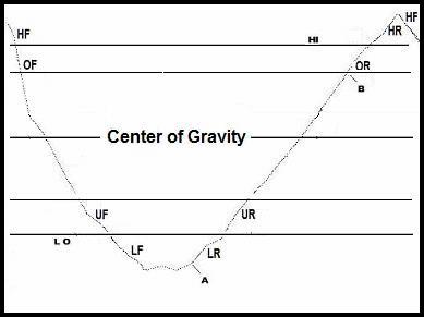
► The “FLAG” column estimates where a stock is as it cycles between being (historically) overpriced and under-priced. All stocks cycle. That is, a stock’s price might swing between $30 and $70 while its “C.G.” is $50. This indicator shows, in the context of historical market price swings, whether a stock is high (at its probable high or higher) and falling (“HF”), overpriced (above “C.G.” but not yet at its probable high) and falling (“OF”), under-priced and falling (“UF”), low and falling (“LF”), low and rising (“LR”), under-priced and rising (“UR”), overpriced and rising (“OR”) or high and rising (“HR”).
How could this information NOT be useful? Where else can you find any attempt at regularly delivering this kind of information on approximately 1,000 stocks?
► It can be used as a kind of “second opinion” regarding stocks in which you have an interest. You might find a stock that appears to have a good chart pattern, and the earnings and other data posted at various websites appear to be good as well. You could create a discipline in which stocks must satisfy your favored metrics from the Web and also certain metrics in The Valuator. If they don’t, you simply walk away from the situation and look for something better.
The Valuator provides data that can easily be manipulated and sifted by users. For example, you might sort all stocks by the % TO C.G. column so stocks that are most underpriced appear at the top. Then you might select the top 100 of these and sort them again by the “Strength Rank” column. This will place the strongest of the most undervalued stocks at the top of the list. You can continue sorting until you have the combination you want. This capability should make it easier to find stocks that satisfy the particular requirements of your discipline. You cannot do this on any other website because our strongest stocks algorithm is proprietary and cannot be found anyplace else. For example, study the short description of our “Strength Rank” system below. You will quickly see that it involves much more than the simplistic RSI (Relative Strength Index) used at most websites. Try this experiment. Use a screener and sort the thousands of stocks out there for Relative Strength. Look at the charts of the top 40 stocks. Print the charts for comparison purposes later. Now print the charts that rank in the top 40 of the 1,000 tracked in The Valuator using our “Strength Rank” algorithm. The difference will probably amaze you. You will quickly learn that the RSI lets a lot of “junk” through the screen. Many of its top rated stocks will have poor patterns or overhead resistance just above the current prices. You will have to see it to really appreciate the difference. NOTE: When sorting, your selection should start at row 4. You will have problems if you start above that row.
Explanations
Selecting The Stocks To Track To create the list of stocks to track in The Valuator, we start with the Reuters database of over 8,000 stocks. We filter out all preferred shares (there are thousands) because it is very difficult to find charting programs that recognize the symbols of preferred shares. If a company has preferred shares, it has common shares. We also filter out stocks that do not trade on the day we create or update our list. Such stocks either have extremely low liquidity, the exchange has halted trading for some reason, or the stock has been de-listed. The company may also be under investigation by a regulatory authority. When we finish with the filtering, we still have more than 4,000 stocks. We then rank the stocks in terms of the dollars traded per day. Finally, we select the 1,050 highest ranked stocks on the list. When we replace stocks that are no longer trading, we try to use the highest ones on the list that we are not already tracking. However, when selecting or replacing, we do sometimes omit some at our own discretion. Because of the daily dollar amount traded, we consider the stocks we track to be among the most important stocks traded on the market. The number of stocks being tracked by us at any given time will vary because of mergers, de-listings, additions, etc.
Explanation Of Column Contents
Alerts If a stock can rise 10% or more before reaching its C.G., and if it has positive momentum, a “►” is displayed at the far left. If a stock can rise 6% or more, before reaching its C.G., and if it has positive momentum, a “♦” is displayed at the far left. However, a stock with an “♦” alert may continue rising after it reaches its C.G. and end up returning 20% or more, just as a stock with a “►” alert could end up returning 20% or more. That’s because stocks swing above and below their C.G. The alerts in the far left margin are in reference to a C.G. based on the 50-day moving average. The columns “H” and “I” have the data being referenced here. Now, look at column “J” with the following heading “Reg C.G.” That column gives the latest number for the regression line, our alternative calculation for the “Center of Gravity.” The percentage distance to the C.G. is in the next box to the right. The two methods are separated in the spreadsheet by a double vertical blue line for easy reference when navigating around the spreadsheet. If a stock can rise 10% or more before reaching its regression C.G., and if it has positive momentum, a “●” is displayed at the left of the company’s name. If a stock can rise 6% or more, before reaching its C.G., and if it has positive momentum, a “▲” is displayed at the left of the company’s name. These indicators are not recommendations. They only highlight stocks that might warrant further attention. For example, a stock that is flagged with “►” or “♦” may fall even further below the C.G. These alerts are given so you can focus your attention better. Monitor these stocks and wait for them to have a decent amount of positive momentum or until they begin a definite uptrend before you consider them for purchase. You should be interested only in stocks that are low and rising, not in stocks that are low and falling. Even with low and rising stocks, there may be overhead resistance that would make a purchase inadvisable. Always look at a chart before making a decision. Look at the bottom half of the “Stock Alerts” page for examples of “setups.” Learn how to identify resistance. Read our tutorials.
Company Name & Symbol These headings should all be self-evident.
Flags This column shows where a stock is in its cycle. It defines eight positions in a stock’s cycle: 1. “HF” = High and falling, 2. “OF” = Overpriced and falling, 3. “UF” = Under-priced and falling, 4. “LF” = Low and falling, 5. “LR” = Low and rising, 6. “UR” = Under-priced and rising, 7. “OR” = Overpriced and rising, and 8. “HR” = High and rising. Refer to Column “G” for clarification. It gives two price ranges for each stock. If a stock is below its highest low, we consider it to be “underpriced” and give it a “U” label. Likewise, if it is below its lowest low, it is “low” (“L”). If it is above its lowest high, it is “overpriced” (“O”). If it is above its highest high, it is “High” (H”).
10-Day Mom This column shows momentum. Here, it is the percentage change of the stock’s price over the last 10 days.
Probable Low & Hi The figures reflect the one standard deviation envelope about the C.G. That is, there is a 68.26% probability that the price will range between the displayed low and high. It does not mean there is a 68.26% probability that the stock will reach the high or low displayed, but only that it is most likely to range between these two levels, based on the pattern of the probability envelope of price action over the most recent 50 days. There is , therefore, a 31.74% probability it will move outside this range (15.87% probability the price will rise above the high indicated and a 15.87% probability it will drop below the low indicated). We dropped numbers to the right of the decimals. We did not average up to the next round number.
Price C.G. We no longer worry about “Fair Value” as determined by analysts (it takes too long to find out if the stock is going to get there, and it is also too “iffy,” because it depends so much on the analyst’s interpretation of whatever data has been given him, as well as the accuracy of his predictions about future earnings, how old his analysis is, and so on). Instead, we now calculate the stock’s price “Center of Gravity.” It is the price of central tendency about which the stock’s price fluctuates, somewhat like a moth’s orbiting of a light bulb. It is the price to which the stock is most likely to return in the short-term or intermediate-term. For this publication we have two calculations. We use the 50-day moving average for the “Center of Gravity” because “regression to the mean” works. We also use linear regression to determine the “Center of Gravity” from another perspective. Both work well for this purpose. [For information on the concept of returning to the mean in stock behavior go here.] Bear in mind that a stock can remain above or below its 50-day moving average for very long periods of time. That’s why a person should do a little research before buying any stock. Also, a person should not buy a stock without it having generated a buy signal or unless it has, among other things, positive momentum. Another important factor is overhead resistance. For example, we would consider it to be foolish to buy a stock for $50 a share if there is resistance at $51 a share. Please see the “Stock Alerts” page for information about “setups.” Focusing on “setups” can greatly reduce risk when buying stocks. Look at the following headings in The Valuator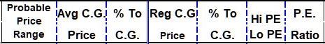 The second box refers to “Center of Gravity” based on the 50-day moving average. The third, “% To C.G.” is the amount a stock can before reaching its “Center of Gravity.” The fourth box (Reg C.G.) is the “Center of Gravity” as determined by using linear regression, and the fifth box is the percent a stock can rise before reaching its regression-based C.G. Now, lets look at C.G. more closely. What follows is referencing the 50-day moving average C.G. but it applies also to the Regression-based C.G.
% To C.G. (or, “% To Center of Gravity”) This is the amount a stock can rise before it reaches its “Price of Greatest Probability.” If you take a wire or string and stretch it so that it is tightly drawn between two points, then pluck it, the string will vibrate up and down, repeatedly moving across an imaginary straight line connecting the end points of the string. When the string stops vibrating, it will be perfectly aligned with that imaginary line. The “Price Center” is the “Center of Gravity” (C.G.), “price of Greatest Probability,” or “target Price.” For our model, this is what we use for “Fair Value.” However, it is based on statistics, not on the ruminations of an analyst. It is based on the laws of probability and the actual just-taken measurements of the stock’s behavior. The assumption is that prices tend to “vibrate” or swing above and below the average price (or , alternatively, their regression line). After all, a moving average is, by definition, the mean of all the points in a given period of time. That makes the average the theoretical level of highest probability in that given time period. We refer to the center about which all price swings converge as the “C.G.” Theoretically, from a purely statistical point of view, a stock is much more likely to move to its C.G. than to any other price. A reading of 15% means that the stock must rise 15% to reach its “Center of Gravity.” A reading of -15% means that the stock must decline 15% to reach its point of equilibrium. A strong negative reading means that the stock has been very strong recently. See if it has a high “Strength Rank.” If it does, treat it as you would any high strength stock. We post the C.G. for each stock tracked as well as the median for the entire group of stocks covered. This indicator can be used to locate stocks that are “under-priced” and that therefore have appreciation potential (by returning to their CG). Thus, the indicator can be used in more than one way. Never use it in isolation from other analysis. For example, just because a stock has a large number here does not mean it is ready to return to its CG. Just because it has a large negative reading does not mean it will continue rising. Look at the entire picture, not just at one indicator. Also, look for the combination of a rising 50-day moving average and a decent “% to C.G.” While a stock may return to its C.G. even if the 50-day moving average is declining, your chances are much better with a rising 50-day moving average. (Note: stocks with high “Strength Rank” in a rising market will tend to have a strongly rising 50-day moving average. Check it out.) Also bear in mind that if a stock has a rising 50-day average, the stock is generally rising faster than the average. If the average is falling, the stock is generally falling faster than the average. Also, stocks above their C.G. will tend to get support at the 50-day moving average if they decline to that level. Stocks below their C.G. will tend to encounter resistance at the 50-day moving average if they rise to that level. The 50-day moving average and the linear regression line are calculated differently, and usually result in different numbers. In our tests, both seem to work equally well in calculating a useful C.G., even though buy and sell points are sometimes quite different.
P.E. Ratio This is the current PE-ratio (as obtained from Schwab). It is based on earnings for the last 12 months.
Last Signal This column reports the last signal generated by Donchian’s dual moving average crossover system. If the 5-day moving average last crossed from above to below the 20-day moving average, the word “SELL” will be displayed. If the latest cross of the 5-day moving average was from below to above the 20-day moving average, the word “BUY” will be displayed. These are not recommendations. Rather, they are the signals generated by Donchian’s system. If the crossover occurred months ago, but there have not been any crossovers since, the latest signal will continue to be displayed.
14-Day RSI Wilder’s 14-day Relative Strength Index.
Strength Rank % This is a percentile ranking. For example, 90% means the stock is stronger than 90% of the stocks being covered. It measures recent stock strength and gives greater weighting to stocks that show more consistency in their recent performance. A proprietary algorithm is applied to more than 4 separate measurements to derive this figure, and then the combined scores are ranked relative to each other. At the bottom of the Strength Rank column we put the rank necessary for a stock to be among the top 75. We do the same thing for 10-day momentum, % to C.G., 14-day RSI, and 14-day CCI. In addition, to the right of the Strength Rank column, we place a “◄” if the stock ranks in the top 75 for strength. We have made extensive use of “Strength Rank” in developing our own watch lists. We track the stocks identified by The Valuator as having a high Strength Rank and monitor some of the strongest, waiting for pull-backs. Even when investing in these stocks, investors should wait for a pullback. They should try to time their entry to coincide with when the stock has pulled back to its rising trend-line and then wait for a “trigger event.” The trigger event would be a sign that the stock is rebounding off its rising trendline. In other words, new buyers are accumulating the stock. Some stocks highly ranked in this column may have simply gapped to a higher level because of speculation related to a possible takeover by another company. Such stocks may have limited upside potential. Whether or not this is the case for a particular stock can be determined by a visual inspection of its chart. We tend to avoid stocks that have suddenly started trading at a much higher price.
In a strong market, most stocks will be above their 50-day moving average, so there will be few signals in the left margin. However, there are other ways to find potential “buy” candidates, and the strength rank is one of them. Because the strength of
these stocks tends to persist, the odds of a decline are reduced. Buying on pull-backs is one very effective strategy. On the
other hand, many investors like to simply “board the train” and go for a ride with such stocks, following their positions with a tight stop loss.
We call our strength measurement “Persistent Strength.”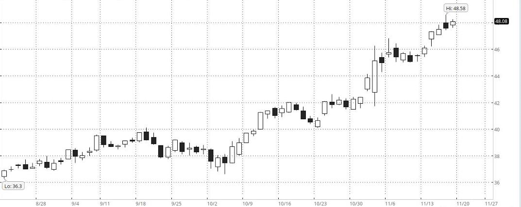
This is an example of a stock with “Persistent Strength.” The stocks covered by The Valuator are each assigned “Persistent Strength” rank. The Valuator also indicates which stocks rank in the top 75 out of the 1,000+ stocks covered. All a subscriber has to do is look in the strength column to see what the rank is for each stock. Other pages you may find interesting include Calculating stop losses with The Valuator. More on stop losses. Get more Information
14-Day CCI For how to use this tool, go to https://stockdisciplines.com/cci-signals/
Std Dev This is the standard deviation of the stock over the last 50 trading days. This figure can be used to position stop losses based on the stock’s own normal volatility. Usually traders multiply this number by a certain amount (1.5, 2.0, 2.5, etc.) then subtract the result from the recent high, low, or close to locate the stop loss. Experiment a little to see what multiple of this figure works best for you.
Avg True Range Wilder’s Average True Range (ATR) is a measure of the average change in price from one day to the next. The ATR does not take the actual change in closing price each day and average those changes. Instead, the ATR is determined by computing the maximum of several ranges from one day to the next. This range is generally greater than the actual change in closing price and it factors in any price gaps from one day to the next. The Average True Range (ATR) we post is the average of the True Range of a stock over the most recent 14 days. This figure, or a multiple of this figure, is often used to determine the placement of a stop loss.
Who is Winning? This is located at the top right corner of the spreadsheet. This indicates the ratio between positive momentum stocks and negative momentum stocks.
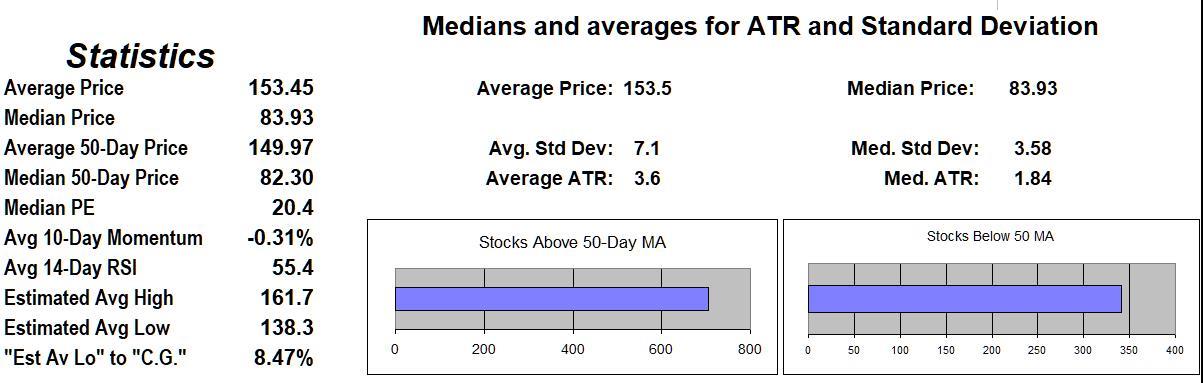
In the above graph, you will find the average price, the median price, the average standard deviation, the median standard deviation, the average ATR, and the median ATR. There are circumstances in which an individual will want to use one of these figures in calculating a stop loss, especially if data for a particular stock is not available.
In the tables, a positive number in the “% toC.G.” column indicates how much the stock is below its C.G. Therefore, it also represents its potential gain if the stock returns to its C.G. A stock showing +34% in the “% toC.G.” column has fallen below its C.G. and it may continue to fall for a long time. Such stocks are falling for a reason, and buying can be a mistake. However, the table lets you know that, if it rises, it will have to rise 34% to reach its C.G., where it may encounter some resistance, if it has not already encountered it somewhere on the way up to its C.G. On the other hand, if you are looking for “underpriced” stocks, look for stocks that have a positive number in the “% to C.G.” column that also have positive (or at least non-declining) momentum indicated in the “10-Day Mom” column.
Develop A Trading or Investment Discipline
The Valuator contains both fundamental and technical information. This market “newsletter” uses statistics and probability analysis to determine the price “Center of Gravity.” The models used to determine C.G. are based on data that is unique for each stock. It is a tool that facilitates disciplined investing. It helps limit risk by showing how much a stock is “underpriced” or “overpriced” relative to its probability model. It shows the 14-day ATR and the standard deviation (both of which are useful in setting stop-losses), and helps you allocate assets to lower portfolio risk when the market is risky. When used correctly, it could help you protect your assets in a market crash. It also alerts (“Flag” column) as to where a stock is in its cycle as it oscillates between being “underpriced” and “overpriced.” In addition, it flags “underpriced” stocks that are rising (by placing “►” or “♦” to the left of the name). The Valuator is a tool that we use ourselves. Since we had to produce the publication for our own trading and investing activities anyway, we decided that we might as well make it available to others by subscription. We designed it to meet the needs of a systematic or disciplined approach to investing or trading. If you have a spreadsheet, data can be sorted and ranked. For example, you could create a discipline in which you select stocks only if they have to appreciate at least 10% to reach their C.G., that are not only low but also rising faster than half of all rising stocks. You could add other parameters to your strategy, like a certain PE-ratio, or a certain momentum or strength rank. You could require a “setup” chart configuration and a “trigger event” before buying. See the bottom of the “Stock Alerts” page for information on “setups.”
See List of Stocks Tracked By The Valuator
To cut down on expenses, our policy is not to store printed copies for distribution to those who lose their copies, or to provide free samples. Also, we have no electronic archive of past issues. We urge people who want hard copies for future reference, to make copies of their own.
For a brief summary of the main features and an opportunity to place a subscription order for the online version, see The Valuator on our “Products and Prices” page. The link “More info >>” at the bottom of the page will bring you back to this page. You can begin the ordering process here