Stock Alerts
Daily Stock Alerts, Stock Setups, and Signals
Top Portfolio Performance Requires A Good Alert System
In order to have a list of stocks available so you can quickly replace stocks that have just been sold, it is necessary to have a “watch list.” To create a watch list consisting of stocks that are about to surge you must focus on “setups.” Develop strategies, disciplines, and systems that will enable you to find “setup” situations quickly and regularly. First, whatever alert you will want to act on, it would be helpful if it had an underlying strength, in addition to having a “setup” configuration. That underlying strength will greatly enhance the odds that the “setup” will not disappoint. So, it would be helpful to start with the strongest stocks in The Valuator. Those ranked 75% or higher will include about 250 stocks that are stronger than 75% of the most important stocks traded on the U.S. markets. Next, you need to learn how to recognize what would signal a pending breakout, break-down, or the possibility of a new trend (there are a number of these). The Donchian systems and the R.C. Allen triple moving average crossover system (and its variants) are such systems. Chart stocks with the moving averages of these systems and then enter the symbols of the stocks you want to check. However, there are other types of alert that do not include The Donchian system or the R.C. Allen system. We will illustrate these alerts on this page.
We said earlier that you should start with a list of very strong stocks. You should have a heavy-duty real strength screener not just the RSI. For this see the column heading “Strength Rank %” in The Valuator. If you know how to sort a column in a spreadsheet, sort this column, placing the highest strength rating at the top. If you do not know how to sort, just copy and paste in a separate place all stocks with a 75% or higher rank. The list you make should be useful for a month. Bear in mind that this strength rating, by itself, is an alert configuration. These stocks have strong positive momentum that tends to persist. Therefore, a very good strategy would be to buy such stocks on a pullback when a “trigger event” occurs. That is, on a pullback, a stock will have a series of declining highs. Once the stock has reached the support of its trendline or moving average, wait for a high that is higher than the previous day’s high (preferably with an increase in volume). The higher high and the increase in volume would be your “trigger event.” There are other ways to use this list, and we will discuss them below.
Build Your Watch List
The most successful traders and investors do not want to wait 6 months to find out whether a stock will perform. They plan their purchases so that they will know within days or at most a few weeks if their decision to buy was right or wrong. They do this by monitoring a variety of “setups.”
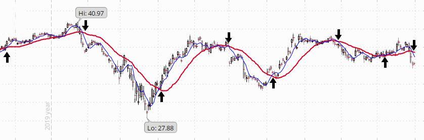
Here is an example. Assume that a stock on your strength list has a rapidly rising 50-day moving average (it is rising at a 35/degree angle or greater). This condition is also a “setup.” So we have a setup within a setup (because the stocks on your original strongest stocks list are also in a setup configuration). Stocks that have a rapidly rising 50-day moving average will repeatedly rise above its 50-day average then pull back to it. Now, as the stock nears its rising 50-day moving average, you would put it on your “watch list” for that kind of alert. The confirmation (“trigger event”) occurs if the stock reverses its downward direction after touching its rising 50-day moving average (institutional investors pay attention to the 50-day moving average and tend to be buyers at such times). Institutional investors know that a rapidly rising 50-day moving average offers strong support on pullbacks. A positive reaction of the stock after a pullback to that average offers a low risk entry point. A stop loss can be placed just below the 50-day moving average (which is not very far below the current price when the stock has just reached the average and is beginning to rebound because of the support there).
Alerts to “Setups” in the StockAlerts System
Aa very strong stock pattern is a “setup” in which you can take advantage of the persisting momentum and go along for the ride. You can “tweak” your use of that setup pattern by buying when the stock retreats to the rising trendline.
In our discussion of “setups,” we will show a chart first, and then we will describe the setup.
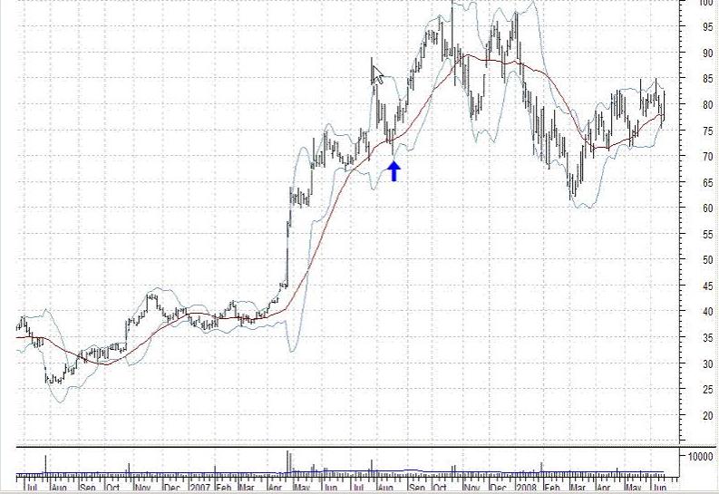
HIGH DN & UP Setup. If a stock is at a new recent high that the stock has not seen for at least 6 months (for example, see the white arrow in the chart) and then “stair-steps” its way down with each successive high lower than the previous high (as between the white and blue arrows), an alert is generated when a high occurs that is higher than the previous day’s high (the day after the day marked by the blue arrow). See if volume declined as the stock fell and increased on its rise. Declining volume on the price decline shows that it is probably only some profit-taking rather than panic selling. The thinking behind this alert is that the stock has been strong and climbing to new highs. Then a wave of profit-taking set in that caused the stock to decline. After that, new buyers take positions and the stock resumes its climb as the demand for the stock once again overwhelms the supply provided by the sellers. Swing traders like to buy the day after the blue arrow (just above $75 in the chart) and hold for the surge in price that follows (up to about $95 in this case). Then they sell and look for other opportunities. The gains on such moves tend to be huge relative to the time invested. No “DN” alerts are generated.
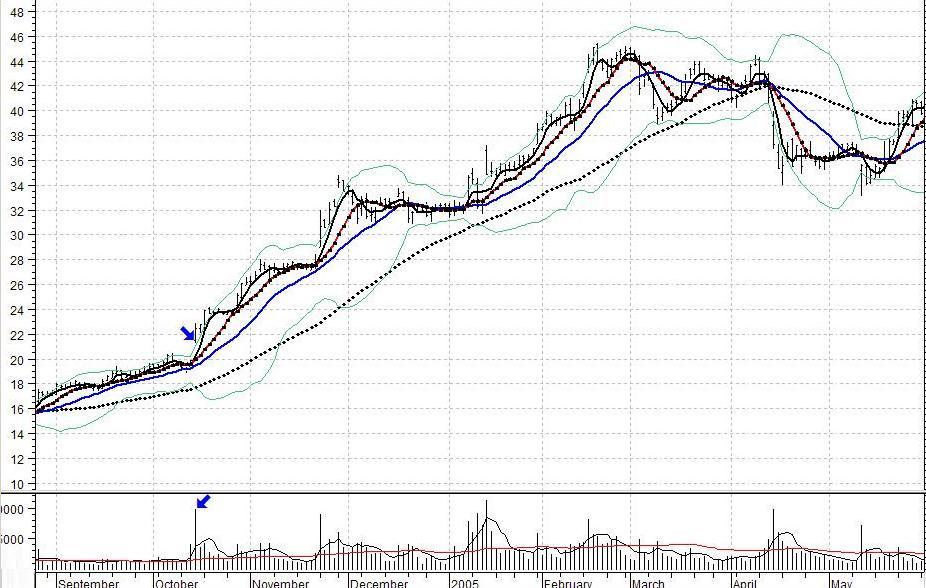
GAP Setups. If a stock gaps up or makes an aggressive move so that its low for the day is at least .25 above the previous day’s high and if volume has a significant surge on that move, an “UP” alert is generated. The reverse conditions will trigger a “DN” alert. Expect a little pullback or consolidation shortly after such moves. In the above chart, a little consolidation takes place at $24 before the next surge. Also, be wary of overhead resistance nearby. That is, if there is overhead resistance just above the gap price, “Walk away.”
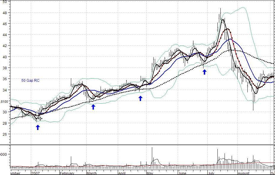
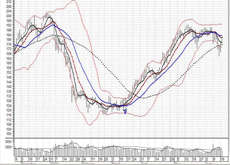
NEAR 50-Day moving average (dotted black line). If the stock’s 50-day SMA (simple moving average) is rising at a good rate and the stock declines to the average and has started to rise again, we consider that to be a “trigger event” or buy signal. Institutional investors tend to be buyers of a stock when it declines to its 50-day moving average. Therefore, the 50-day SMA will often offer support for a stock, but especially if it is rising rapidly. Traders monitor such stocks to see if they begin to climb again when they touch or come close to this average. If the stock “jumps” on increasing volume, traders consider it a buy signal. If it does not rise after touching this average, the stock is not getting the expected support. This is a warning of possible trouble ahead. We have a page illustrating examples of this setup and what to avoid. This page should be visited regardless of the kind of setup you want to use because it illustrates what we mean by a “clean” setup. The key is to avoid setups that are not “Clean.” See clean setups
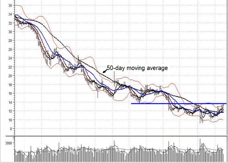
Near 50-day moving average (with average declining rapidly). This is a pattern attractive to short sellers. This setup is the reverse of the conditions in the previous chart. Here, the rapidly declining 50-day SMA (dotted black line) acts as resistance that turns the stock down each time it “tries” to rise. However, once the stock has risen above the 50-day average, short sellers will not have much interest in the stock. [Additional comments: A beginning trader might look at the last days of this chart and conclude that it is a good time to buy. However, notice the resistance where we drew the blue line. When the stock was above the line, that line acted as support. Once the stock plunged below the line on heavy volume, the line became resistance. Therefore, we would reject this stock as a buy candidate. We would not be interested in this stock unless it managed to move above that line, preferably on a surge in volume. We might even wait for the stock to test the support of that line after it climbs above it. As it is, we think the highest probability scenario is for the stock to continue consolidating below that blue line a little longer. We would look for a pattern in which volume increases as the stock rises and declines as the stock falls. Then, a surge in price through that blue line on a surge in volume would be of interest to us. Notice in the above chart that the last rise of the stock was accompanied by a pattern of declining volume. That is a bearish indication, and not at all what should happen if the stock were about to break out above the resistance.]
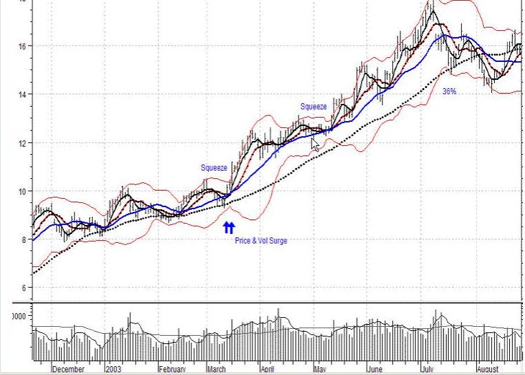
BOLLINGER BAND SQUEEZE. The second of the two above charts shows squeezes of very short duration (see the red lines) used as entry points in a rising trend. Note the rapidly rising 50-day moving average. A period of low volatility often precedes a strong move by a stock. The ensuing move may be a downward thrust or an upward thrust. Traders monitor stocks that have a Bollinger band squeeze (showing that the stock is experiencing a period of low volatility), waiting to see if the expected breakout is to the upside or downside. A “squeeze” is taking place when the upper and lower Bollinger bands are close to each other relative to their recent separation (in the above image, the Bollinger bands are the red lines that envelop the stock’s price pattern). After a squeeze, a thrust above the upper Bollinger band is seen as bullish and a thrust below the lower Bollinger band is seen as bearish. Because what constitutes a good Bollinger band squeeze is relatively subjective, we add the following notes.
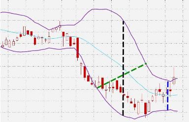
1. Sometimes, our way of looking at a chart convinces us that a squeeze has not taken place even though it has. For example, some people tend to view magnitude of separation by noting distance between bands along a line like the green dashed line in the chart below. That is, they make the mistake of comparing the distance along the green line with the distance along the vertical blue line, and decide that not much of a squeeze has occurred. Instead, they should compare the black vertical line with the blue vertical line. The length of the green line may even be less than the length of the blue line at the same time the length of the black vertical line is two or three times the length of the vertical blue line. The spread between the Bollinger bands at specific points in time is given in the chart below by the black line and the blue line, not by the green line. The green line is not determined at a single point in time. Therefore, the correct procedure is to draw vertical lines at the two dates of comparison and note the difference in their lengths.
2. The investor should examine the squeeze relative to a stock’s squeeze pattern and relative to the current context. There are hundreds of stocks that penetrate a band without any squeeze (this is what you get at other websites). A band penetration without a previous squeeze is nearly meaningless.
3. A squeeze does not have to last for a week, a month, or any other set period to mean a squeeze has taken place. If the two bands narrow their separation for even a day, that is a squeeze. Why? the Bollinger band equations are based on a 20 day measurement. When a squeeze is registered, it is based on data covering 20 days and is plotted on a chart relative to the period before that. Some traders consider only squeezes that have lasted for at least one or two weeks to be worth while. Others consider any squeeze to be worth while. Our own traders have had great success acting on very short-term squeezes. Of course, the context of a squeeze is extremely important.
4. The standard approach is to look for squeezes in which the band separation is less than at any time in the previous 6 months. We focus more on the amount of squeeze that is taking place rather than how long it has been since band separation has been that small. It is our experience that very good alerts can be based on a significant narrowing of band separation, regardless of how long it has been since the last separation of comparable magnitude. We really don’t care very much if there has been a tighter squeeze within the last 6 months. We have found that sufficiently tight squeezes (regardless of how long it has been since the last tighter one) are well worth our attention.
6. An alert occurs if there has been a Bollinger Band squeeze and the closing price is above the upper band or below the lower band. It does not require that the penetration be the first penetration. You may see some stocks for which a band has been penetrated one or more times already. However, if the bands are still in a squeeze pattern, those stocks are still of interest.
Richard Donchian’s 5×20 Dual Moving Average Crossover System (a variation). If the 5-day MA (moving average) crosses from below to above the 20-day MA, with an increase in volume, we have a possible buy “alert.” The opposite conditions with an increase in volume would constitute a possible sell alert.
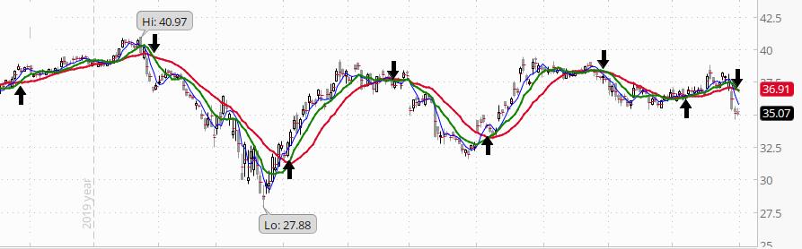
R.C. Allen’s triple moving average crossover system. We use the same chart here because the alternating buy and sell signals illustrate the system well. Our tests on thousands of stocks over many years and under a variety of market conditions has convinced us of the power of both Allen’s 4x9x18 (4-day moving average, 9-day moving average, 18-day moving average) system. If the 4-day moving average is above the 9-day moving average and the 18-day moving average, and the 9-day moving average has just crossed from below to above the 18-day moving average, we have an R.C. Allen potential buy signal. If the 4-day moving average crosses below the 9-day moving average and the 18-day moving average, and the 9-day moving average has just crossed from above to below the 18-day moving average, we have an R.C. Allen potential sell signal.
The kind of “setup” that produces the best candidates varies over time with changing market conditions. For example, gap alerts may yield the most attractive candidates at one time, but Bollinger Band squeeze alerts may yield the most attractive candidates at another time. In other words, at any given time, a particular alert system may not yield many attractive candidates but may do so at another time.