Alerts – McClellan Oscillator – Summation Index – Chande Momentum Oscillator – Stochastic Oscillator – MACD – Market Bias
This site is managed in California (Pacific time).
Video: Indicator Review Navigating this site
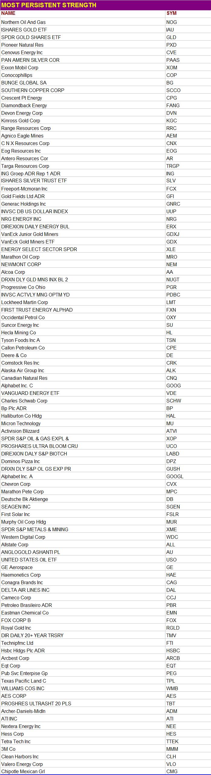
“Persistent Strength”
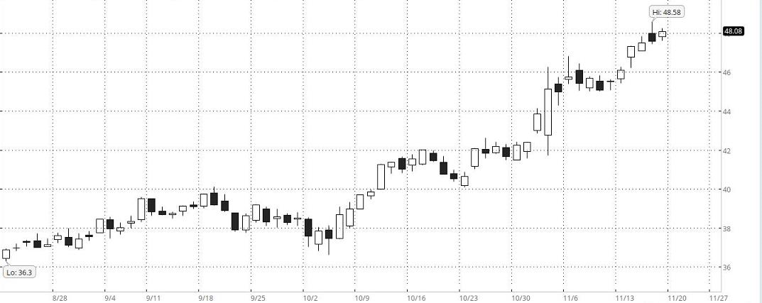 This is an example of a stock with “Persistent Strength.” Among other algorithms, The Valuator has one that is designed specifically to find stocks with “Persistent Strength.” The stocks covered by The Valuator are each assigned “Persistent Strength” rank. The Valuator also indicates which stocks rank in the top 75 out of the 1,000+ stocks covered. All a subscriber has to do is look in the strength column to see what the rank is for each stock. It includes the ATR and Standard Deviation for each stock to aid in stop loss placement. It includes the latest Donchian “Buy” or “Sell” signal for each stock. It flags stocks that are low, rising, and have 10% or more to go before reaching their “Center of Gravity.” There is much more. Calculating stop losses with The Valuator. More on stop losses. Get more Information
Dow Jones Industrial Average
Click on chart to enlarge it. Return to normal size by pressing Alt + Left arrow
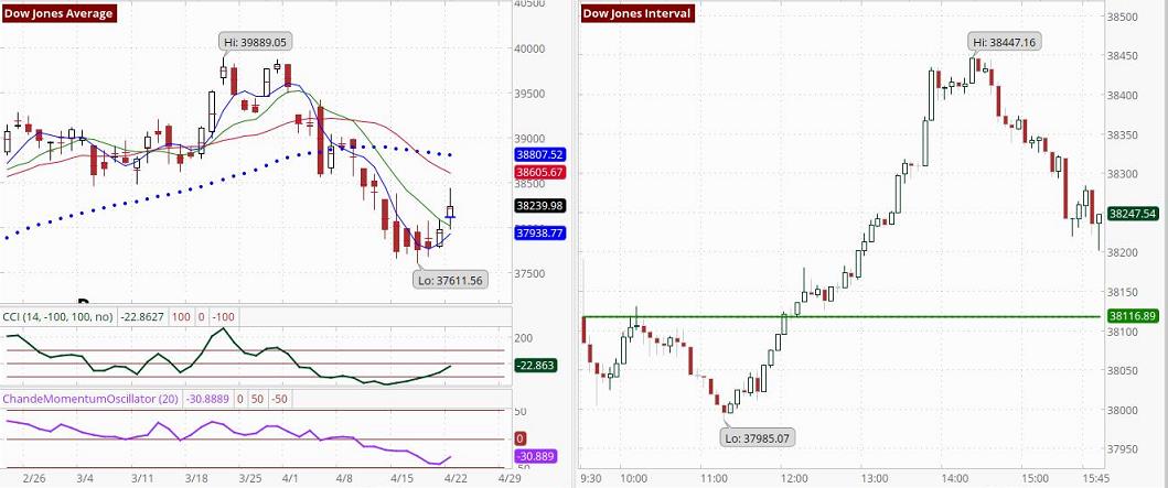 Moving Averages: 4-day (Blue), 9-day (Green), 18-day (Red), 50-day (Black Dotted). The charted CMO is based on 14 days. In the table lower on this page, it is based on 20 days. Both measurements are considered to be standard. Chart on right shows 5-minute intervals. See CCI signals.
The S&P 500, and the Nasdaq
Click on chart to enlarge it
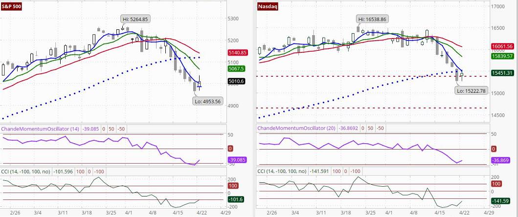 Moving Averages: 4-day (Blue), 9-day (Green), 18-day (Red), 50-day (Black Dotted) See CCI signals.
U.S. Stock futures: Time: Tuesday, 4:02 AM Pacific (approximate)
S&P is up 17.5 points or 0.35%, the Nasdaq 100 Index is up 67.5 points or 0.39%, the Dow is up 109 points or 0.28% and the E-mini Russell 2000 is up 2.6 points or 0.13%.
Market Status Report
In the following market status report, the term “Donchian system” refers to Donchian’s system, which focuses on crossovers of the 5-day and 20-day moving averages. R.C. Allen’s system is focused on crossover events and alignments. Also, the third moving average enables a more nuanced interpretation. Below, we base our comments on the 4-day, 9-day, and 18-day moving averages used in R.C. Allen’s system and on the 5-day and 20-day moving averages used in Donchian’s system. These reports are generated by PAL.
▬ Stocks closed higher on Monday as investors anticipated a busy week for quarterly results from major companies that would provide a glimpse of the U.S. economy’s health. The S&P 500 and the Nasdaq rebounded from a decline over the past six sessions which had been caused by investors re-evaluating their expectations on interest rate cuts in the wake of strong economic data, geopolitical tensions, persistent inflation and disappointing commentary from Federal Reserve officials. All 11 S&P 500 sectors closed higher, with technology and financial stocks leading the gainers.
▬ The Dow closed at 38239.98, up 253.58 points or 0.67%, the S&P 500 closed at 5010.6, up 43.37 points or 0.87%, and the Nasdaq Composite Index closed at 15451.3, up 169.29 points or 1.11%.
▬ The Dow has had a sell signal, and there is now a negative bias against large-cap high-quality stocks like those in the Dow. According to the R.C. Allen system, such stocks are now in a down-trend, and sellers are on the right side of the market. However, please note the chart of the McClellan Summation Index lower on this page. Notice that the points are beginning to bunch (getting closer together). This is what we would expect before a trend reversal. Relative to yesterday’s readings, the 4-day moving average has risen, the 9-day moving average has declined, and the 18-day moving average has declined. The last signal generated by Donchian system was a “Sell.” Relative to yesterday’s readings, the 20-day average is declining, and the 5-day average is rising. The 5-day moving average closed at 37,910.81. The 20-day moving average closed at 38,674.91.
▬ The Nasdaq has had a sell signal, and there is now a negative bias toward stocks on the Nasdaq. Be aware that the negative bias may be focused on technology stocks. The trend for the Nasdaq is to lower levels. Relative to yesterday’s readings, the 4-day moving average has declined, the 9-day moving average has declined, and the 18-day moving average has declined. The last signal generated by the Donchian dual moving average system was a “Sell” signal. Relative to yesterday’s readings, the 20-day average is declining, and the 5-day average is declining. The 5-day moving average closed at 15,576.69. The 20-day moving average closed at 16,090.41.
▬ We estimate that if a stock benchmark is above our estimated bullish target level for more than 30 minutes of the first hour of trading, that benchmark is very likely (≈ 80% probability) to close higher. The bullish target value for the Dow is 38,401. The bullish target for the S&P 500 is 5,028. The bullish target for the Nasdaq Composite Index is 15,530. On the other hand, if a stock benchmark is below our estimated bearish target level for more than 30 minutes of the first hour of trading, that benchmark Is very likely (80% probability) to close lower. The bearish target value for the Dow is 38,079. The bearish target for the S&P 500 is 4,993. The bearish target for the Nasdaq Composite Index is 15,373. Updated 4/22/24
Daily Market Bias Indicator (MBI)
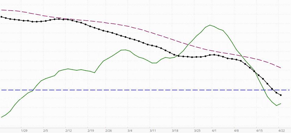
When the black line with dots (the indicator line) is above the horizontal blue line, this indicator is telling us that the market has a positive or bullish bias (in the short-term to intermediate-term, even if not in the long-term). If the black dotted line is declining toward the horizontal line, bullish sentiment is decreasing but still present. A negative or bearish bias will be indicated when the black line crosses below the horizontal line.
Assume, that the market has a positive bias (the black line is above zero). If the green line is rising, it is confirming that the environment is supporting bullishness. In this case, long-term and intermediate-term investors who take bearish positions will be in an environment that is working against them.A declining green line in a market with a positive bias means the positive bias is not currently being confirmed … the MBI is detecting counter-currents of negative momentum that are not yet significant enough to change the market’s positive bias status. That means investors may find situations where bearish positions can be taken with somewhat less risk than when the market has a confirmed bullish bias, but because the general environment is bullish, there is still risk in taking bearish positions. Great caution is recommended. Money can be made only on carefully selected bearish positions taken by short-term or intermediate-term investor/traders who know how to trade bearish positions in a market with a positive bias. If the black indicator line crosses below the dark red dashed line, it means that the bearish sentiment is becoming more significant, but since the black line is still above zero, probabilities still favor bullish positioning. In this environment, carefully selected bearish positions are more likely to be profitable than before the black line crossed below the dashed line. From the perspective of an experienced short-term trader, the non-confirmed reading is giving a “go-ahead” for quick bearish trades. Here, the indicator would be giving nuanced information a level deeper than most indicators. If the market has a positive bias, a green line turning down merely means the conditions are not “optimal” for short-term bullish positions. That does not mean they cannot be very profitable if carefully chosen. However, a downturn of the green line in a market with a negative bias is much more problematic for bullish positioning, even for very short-term traders.
Assume, that the market has a negative bias (the black line is below zero). If the green line is declining, it is confirming that the environment is supporting bearishness. In this case, long-term and intermediate-term investors who take bullish positions will be in an environment that is working against them. A rising green line in a market with a negative bias means the negative bias is not currently being confirmed … the MBI is detecting counter-currents of positive momentum that are not yet significant enough to change the market’s negative bias status. That means investors may find situations where bullish positions can be taken with somewhat less risk than when the market has a confirmed bearish bias, but because the general environment is bearish, there is still risk in taking bullish positions. Great caution is recommended. Money can be made only on carefully selected bullish positions taken by short-term or intermediate-term investor/traders who know how to trade bullish positions in a market with a negative bias. If the black indicator line crosses above the dark red dashed line, it means that the bullish sentiment is becoming more significant, but since the black line is still below zero, probabilities still favor bearish positioning. In this environment, carefully selected bullish positions are more likely to be profitable than before the black line crossed above the dashed line. From the perspective of an experienced short-term trader, the non-confirmed reading is giving a “go-ahead” for quick bullish trades. Here, again, the indicator would be giving nuanced information a level deeper than most indicators. In a market with a negative bias, a rising green line is letting an investor know that if they are very careful, there are some opportunities. For example, a setup pattern could offer a good opportunity for a 1-week price surge [a pre-surge “setup” pattern is meant here. For more on these patterns see the bottom half of the Stock Alerts page on this site]. A swing-trader may take such a position to participate in the surge and sell immediately as the surge loses momentum. These trades can enable a person to capture a gain of maybe 3% to 12% and sometimes much more than that (we have captured more than 30% in a single day).
As for the green line, its position above or below either the black Indicator line (or Dashed red line) is not relevant. It is the direction of the green line, not its position, that is relevant.
The dashed red line can be used in combination with the black dotted line as a short-term buy/sell signal generator, but all signals must be confirmed by the green confirmation line. For example, say the black dotted line is below the horizontal line (indicating a negative market bias), and it crosses above the dashed dark-red line. If, at the same time, the green line is rising, then a cross above the red line may be interpreted as a buy signal in a negative environment for a short-term trade. All such signals must be viewed with respect to the prevailing context and the risks implied by the current configurations. Nothing on this Website should be interpreted as a buy or sell recommendation. Our indicators may generate buy or sell signals, but never buy or sell recommendations.
So, what if the Indicator line is above zero (indicating a positive bias), but it has crossed below the broken red line? If the green line is declining, it is confirming that bearish positions can be taken within the bullish environment. However, it must be remembered that risk is higher than if the market has a bearish bias. If the green line is rising, it is not confirming the short-term sell signal created by the Indicator line crossing below the red dashed line. Instead, it is confirming the positive bias indicated by the black indicator line’s position above the zero line.
On the other hand, if the Indicator line is below zero (indicating a negative bias), but it has crossed above the broken red line, simply reverse what was said in the above comments.
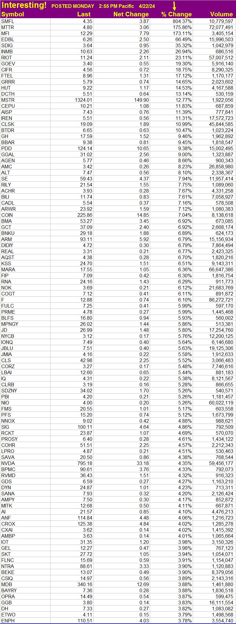
Stocks of Interest Today
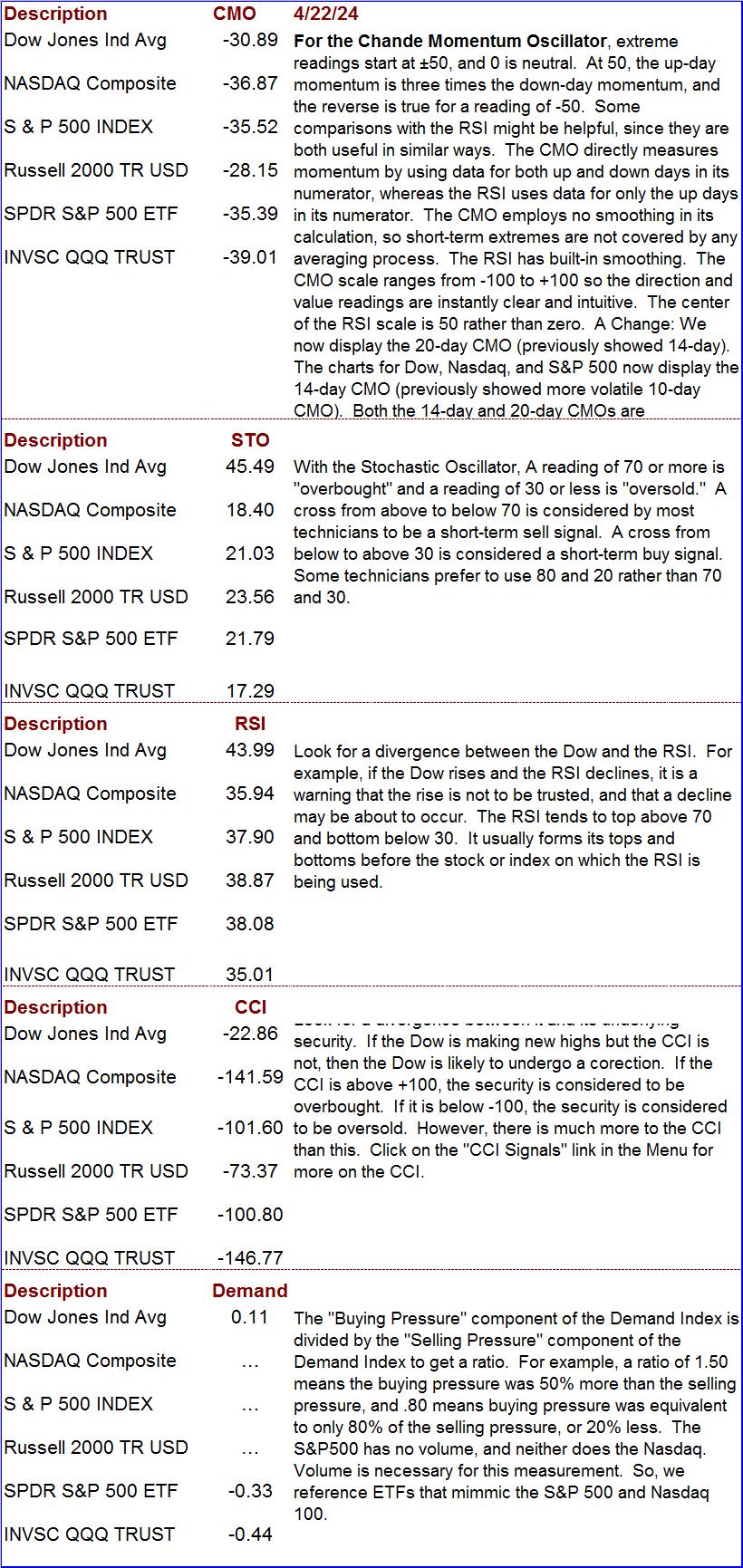
Chande Momentum, Stochastic Oscillator, Relative Strength, CCI, and Demand Index
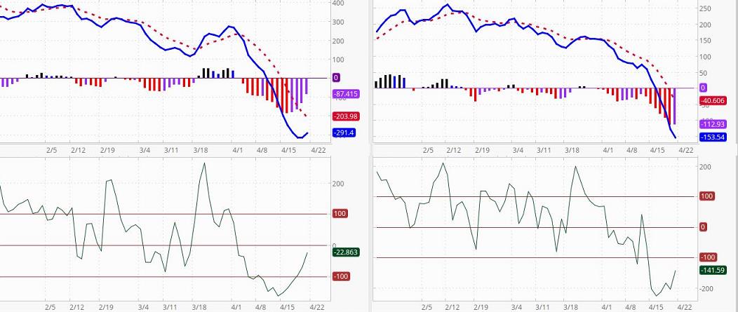
McClellan Oscillator and Summation Index
(Click to enlarge)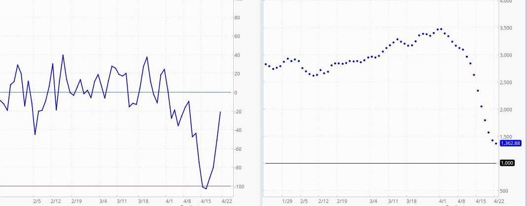 The McClellan Oscillator (left chart) is a breadth-of-market indicator. It is effective for interpreting short-to-intermediate-term market moves. The McClellan Summation Index (right chart) is a running total of each day’s McClellan Oscillator value. The Summation Index is effective for interpreting intermediate-to-long-term market moves. Together, they can be useful in evaluating the dynamics of the ebb and flow of the market, and in planning entry and exit points.
Oscillator readings of 150 (plus or minus) are extreme and tend to correlate well with buying and selling climaxes in the market. The Oscillator reaches these extreme values, measuring overbought and oversold conditions, in advance of market turns. It then passes through zero at or very soon after market turning points (to put this in perspective, extreme readings occur much less frequently than a pass through zero. The type of action to be taken, if any, depends on the major trend of the market (as indicated, for example, by the Summation Index) and on whether the move originated from an extreme reading. Thus, in the early and middle phases of a bull market emphasis might best be placed on buy signals. In a bull market, buy signals occur earlier, and positions can be taken when the oscillator clearly moves out of its basing pattern, even if it is still negative. In a bear market, sell signals occur when the oscillator moves clearly put of a topping formation, even if it is still positive.
The amplitude of the oscillations above and below zero correlates with the general volatility of the market. The oscillator shows distinct cycles (lasting 22 to 24 weeks) between significant bottoming formations. Divergence between oscillator moves and conventional market indicators forecasts an impending change in market direction. Conventional trend-line theory can be applied to oscillator patterns. For example, a triple top formation in the McClellan Oscillator forecasts a termination of the preceding up-trend.
If the Summation Index is rising (or declining), it is intermediate-term bullish (bearish if declining) and the market’s trend is up (down if the Index is declining). If the Index is declining, the first positive sign will be a slight narrowing of the gaps between postings. The second positive sign is a flattening out of the entries (but this stage is sometimes skipped). The third positive sign is a reversal in direction. Some investors use the second posting in the positive direction as an early buy signal). They view the opposite conditions as negative, culminating in a sell signal.
Short-term vs. Long-term Treasury Rates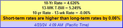
The above data can be very useful when formulating an investment outlook or strategy. When short-term rates are 1.3% to 2% below long-term rates, investors expect normal economic growth (2-3 percent per year). When the spread is greater, they expect even faster growth because the Central Bank is likely pushing rates down. This reduces the cost of borrowing for companies so they can expand capital investment. When short-term rates are higher than long-term rates, Central Banks are probably trying to curb inflation. Economic conditions are expected to deteriorate. When short-term rates exceed long-term rates by 1.5% or more, there is a 70% chance the economy will go into recession within the next 12-months. The foregoing can serve as an investment guide. If short-term rates are higher than long-term rates, tighten stops or take other protective measures. If they are 1% or more higher, consider moving to cash (the short-term curve was this far above the long-term curve in 2000 and a 3-year bear market began in that year). When short-term rates are less than 1% below long-term rates, stable growth stocks are attractive. When short-term rates are 1% to 3% less than long-term rates, stocks are even more attractive (a stock-picker’s market). If the spread is more than 3%, invest with the premise that inflation could start to heat up soon.
Stochastic Oscillator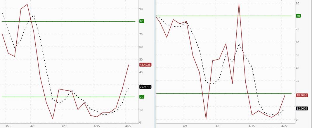 Left chart is the Dow. Right chart is the Nasdaq
The Stochastic Oscillator indicates where a security’s closing price is relative to its trading range over the last x-time periods. There are several ways to interpret the oscillator. First, buy when the oscillator falls below 20 and then moves above that level, and sell when it rises above 80 and then falls below that level. However, it is important to determine if the security (or market index) is trending by using an indicator like a moving average (note whether the average is rising, falling, or moving sideways). If the market is non-trending, then trades based on overbought/oversold levels should produce the best results. If the market is trending, hen the oscillator can be used to enter trades in the direction of the trend. Second, buy when the solid line rises above the broken line and sell when it falls below it. Third, look for divergences. When the security (or market index) is making a series of new highs and the Stochastic Oscillator is failing to surpass its previous highs, we have a warning signal.
The oscillator is a very short-term indicator that tends to be most helpful when trying to determine the probable directing of a security or index in the days immediately ahead. The Stochastic Oscillator used here is known as a “fast” oscillator. Because there is no smoothing in its “K” line, it is very sensitive and will tend to give more false signals than a “slow Stochastic Oscillator.” The greater number of false signals is a trade-off tolerated by shorter-term traders who prefer very sensitive indicators that give immediate indications of current security/market conditions.
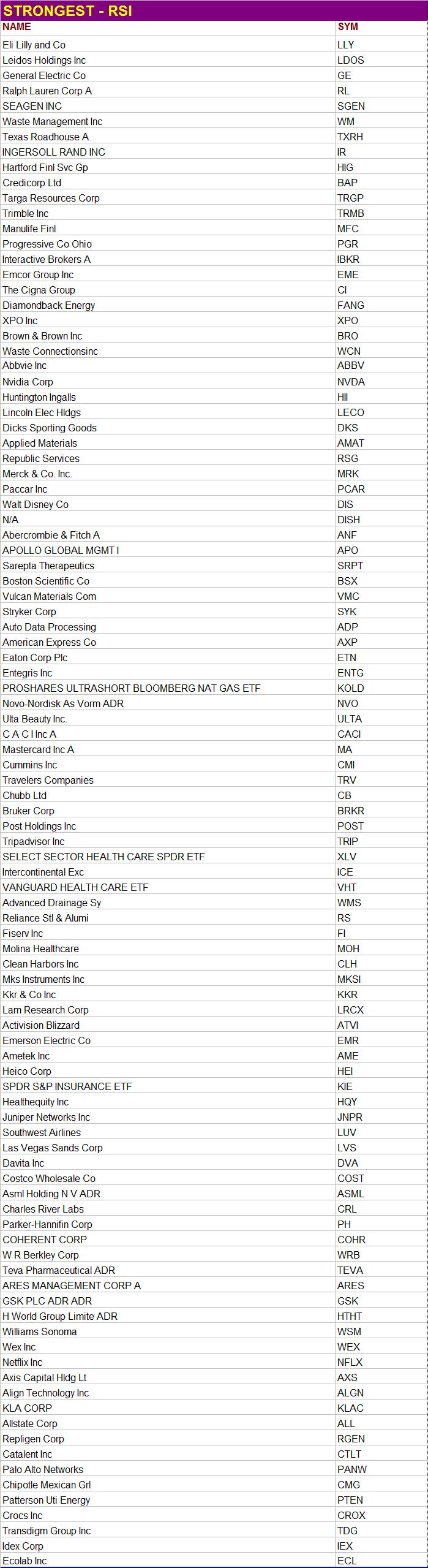
High Momentum Stocks 
RSI Ranking
Data is sometimes slow coming in. When it is taking too long to load a stock’s data, “N/A” will appear instead of the price, and the stock will be placed at the top of the list. Ignore such stocks. They are NOT at the top of the list because they deserve to be there. They are there because that is where the sorting algorithm places stocks for which data is not completely loaded.
High Persistent Strength Ranking
See what this means
The MACD and the CCI
For The Dow (left) and Nasdaq Comp. Index(right)
Click on chart to enlarge it
 (What the readings mean for CCI)
The top chart, the MACD (Moving Average Convergence/Divergence) is a popular buy/sell indicator. Here, we present the MACD chart for the Dow (left) and the Nasdaq Composite Index (right). The MACD is the blue line. The “trigger line” is the dotted red line. The basic MACD rule is to sell when the MACD falls below the broken signal line and buy when it rises above its signal line. A crossing of the zero line is a confirmation of the signal. The MACD can give buy/sell indications in three ways: signal line crossovers (the indicator is bullish if it is above its broken signal line and bearish if it is below this line), overbought and oversold conditions (the MACD is in an Overbought/Oversold range when it pulls dramatically away from the broken line; when this occurs, it is likely that the market is overextending and will soon reverse direction), and divergences. Divergences occur, for example, when price makes a new swing high or a new swing low, but the MACD histogram does not, indicating a divergence between price and momentum. Bar Colors: Red = Negative & Down, Purple = Negative & Up, Blue = Positive & Down, Black = Positive & Up.
The lower chart is the CCI. It is based on the Dow (left) and the Nasdaq Compsite Index (right). Traders often check the CCI to see if there is divergence between it and its underlying security. They also look for overbought and oversold conditions. If the Dow is making new highs but the CCI is not, for example, then the Dow is probably heading for a correction or pullback of unknown magnitude. The CCI usually ranges between +100 and -100. If it is above +100, the underlying security is considered to be overbought. If it is below -100, the underlying security is considered to be oversold. However, there is much more nuance to the usefulness of this analytical tool.Learn more.
SETUPS: Increase your odds of making a profit by focusing on “setups,” chart configurations that are most often seen before a price surge. Be sure to wait for the “trigger event.” A “trigger event” is your buy signal, assuming there is not overhead resistance or other contrary indications. For more on setups, go the Q&A page and read item 13. Then use the link at the end of that explanation.
What is PAL?
These Indicator charts will be updated weekly (sometimes more often). If an indicator chart is based on more than one day, it can take several days for the indicator to show much of a change even if the index makes a big move on a single day. Even if an indicator is very sensitive to daily Index changes, it can be helpful to compare the current Index with the posted chart.
The Trading Result For One Of Our Traders
Long ago we proved to our own satisfaction (by trading with real money) that to obtain gains of more than 50% a year it is not necessary to invest in options, currencies, or commodities. It can be done simply by buying and selling stock. All you need is a good discipline (and that you actually follow your discipline). That is what this site is all about. We do not make a practice of revealing the performance of company traders. There is little reason to do so, and it is nobody’s business but our own. However, one of our traders has given permission for us to share her performance on a one-time basis.
After brokerage fees, her net return for the year was 58%. All she did to obtain this return was to buy and sell stocks in a very bad market. She simply cut losses quickly, focused on good setups, and looked for trigger events. When it was time to sell, she did not talk herself out of it or “argue” with the evidence. She also did not sit “glued” in front of her computer. She entered her trades and set her stop losses. Often, the only time she could check her positions was long after the market closed. She did not have to agonize about margined positions held overnight because they were not part of her discipline.
It might also be worth mentioning that to optimize liquidity, to minimize the spread between bid and ask, and for risk-control reasons, she prefers to avoid stocks that trade for less than $5. Most of the stocks she trades are followed in The Valuator. This trader is a very private person who does not want to report her returns every year, so there is no plan to update this performance in future years. This report was posted shortly after the data was available, and it will be left here for future visitors.
Please be aware that she did have major distractions during this year that almost certainly got in the way of her achieving a significantly greater return. In other words, this was by no means the best she could do. However, she allowed us to reveal her performance anyway in order to encourage others and to show that returns above 50% are achievable (even under less than ideal conditions). [Portfolio returns above 50% per year can be achieved by trading relatively high quality stocks priced above $5 in a cash account.
The discipline used by this trader is extremely low in risk, much lower than the risk assumed by the average mutual fund investor or the buy-and-hold investor in individual stocks. Yes, she could have achieved a much higher return if she had kept her positions highly leveraged. She does not wish to take that route. Greed destroys discipline. Here is a little known fact worth considering. 80% of the people who fully leverage their investments in the futures markets eventually lose all their money. Some people do well in the futures markets. The same can be said for some who trade penny stocks and currencies. However, it is not the use of leverage that makes a winner, but the use of a good discipline. Too many people don’t get that fact.
The discipline used to achieve the above return is our own creation. We do not make it available to the public as part of any service or training program. In other words, we are not providing this performance information to solicit your enrollment in any kind of program. It is provided only to encourage people to be diligent in the development of their own discipline. We will leave this report here to encourage others who may be wondering if working at developing a discipline is worth the effort.
========================================================
Last Spot Bid Prices
Silver – Gold – Platinum – Paladium
Chart provided by courtesy of JM Bullion