Controlling Risk
Controlling Risk With Setups and Timing
Most people know that one way of controlling risk is by diversifying. Another way is by using stop losses to pre-define the amount of decline a stock can undergo before it is sold. On this page, we will discuss risk reduction through the correct timing of purchases, and by purchasing only when there is a compelling “setup.” When our own traders find a good setup, we expect the stock to have a price surge within two weeks. If that does not happen, we sell and go elsewhere. Look at the following chart.
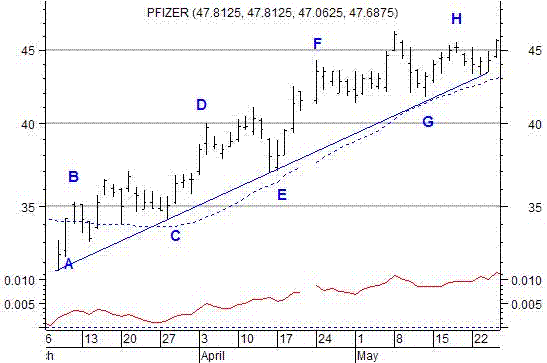
A trendline is a line of support or demand. That is, there is demand for the stock along that line. Support lines also act like gravity wells in the sense that stocks tend to return to their support. When a stock wanders appreciably above its support line, traders consider it to be overbought. Consequently, they sell and the stock declines again to its support where buyers are waiting to accumulate shares. In the above chart, buying at “D” involves much more risk than buying at “E.” Assume that “D” is 10% above the trendline. That would mean that the stock could drop 10% before encountering support. Therefore, 10% is the risk assumed by buying at “D.” It would be normal for a stock to decline from “D” to “E.” Such a decline does not indicate anything is wrong or that the general trend of the stock has changed. Look at the chart. The stock (the chart is of Pfizer) returned to its support line five times in less than three months. This is not unusual. Experienced traders prefer to wait until a stock returns to support before buying. Doing so increases clarity. It enables the trader to enter at a better price while implementing a more reasoned approach to managing risk.
For example, if the trader buys at D, he does not know if the stock will keep rising or decline from the purchase price. What is known, however, is that there is a very high probability that the stock will eventually return to the line marked by the points A, C, E, and G. It may encounter the line at an even higher price or it may decline to that line immediately. However, if the trader waits for the stock to touch that line, he will then know that buyers are likely to enter the market at the point of contact. Therefore, he can place his stop loss just below the line. Say, for example, that he places the stop loss 3% below the trendline. That may seem like a very close stop loss. However, the fact is that the stock is getting support at the trendline. That support should keep the stock from declining through the trendline. At least it should not penetrate it enough to trigger the stop loss. Buying at the trendline and placing the stop loss just below the trendline minimizes the loss if the stock disappoints. Buying at D leaves the trader with considerable uncertainty and risk. Buying at E enables the trader to have a good reason for his purchase (new buyers should keep the stock from further decline), to enter at a lower price, to enter where new buyers are likely to push the stock higher, to better define when something is amiss with the stock, and to limit risk to 3%.
Of course, where you draw the trendline depends on your investment time horizon. In the above illustration, the time horizon is that of an intermediate-term investor. A short term investor, a “swing trader” for example, might consider the trendline of most importance to be the line from E to F in the chart. The same considerations apply with respect to that trendline as with the intermediate-term trendline. The main difference would be that the swing trader would have to use an even tighter stop loss because the expected gain is less.
When you have an established rising trendline or moving average, and the stock declines to that trendline or moving average, you have a type of “setup.” If, after touching the trendline or moving average, the stock rebounds (it has a high above the previous day’s high and if at the same time you see an increase in volume, then you are witnessing a “trigger event.” Expert traders buy on trigger events after a setup configuration has been established. There are many different kinds of setup. For example, look at the next chart.
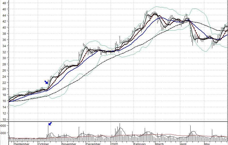
This chart shows the stock penetrating the upper Bollinger band. Such breakouts may result in a price surge or even a new trend. Note the lower arrow marking a surge in volume on the breakout.
A period of very low volatility often precedes a price surge. When volatility is low, the price swings of a stock are minimal. A statistical measurement known as the standard deviation is often used to measure volatility. In the above chart, the green lines measure 2 standard deviations above and below the average price of the stock for the last 20 days. Those lines are commonly referred to as Bollinger bands. When volatility is low, the bands come closer to each other as in the middle of the chart. When volatility is high, they tend to separate (note how far apart they are at the beginning of December). We said that a period of very low volatility often precedes a price surge. Note the top arrow in the above chart. A price surge out of a Bollinger band “squeeze” may last anywhere from a day to a few weeks, and sometimes it is the beginning of a trend that lasts for months. The direction of the surge is indicated by the band that is penetrated. If the upper band is penetrated, the surge is likely to continue upward. If the lower band is penetrated, the surge is likely to continue downward. A Bollinger band penetration without the previous squeeze has no meaning. The penetration must come after the squeeze in order to be significant. It is the squeeze that indicates a period of low volatility (that is why our StockAlerts scanner reports on Bollinger band penetrations only after there has been a squeeze). Notice also the lower arrow. It shows that there was a surge in volume when the upper band was penetrated. There are two moving averages running through the volume bars. The red one marks volume surges that are 50% above the 50-day average of the volume. The volume surge endorses the price move. The pattern is repeated in the middle of the chart.
In the above illustration, the Bollinger band squeeze is the setup. The penetration of the upper band is the “trigger event.” When you have a setup like that pictured above, and a subsequent trigger event, the risk of a sudden decline in price is dramatically reduced. It can happen, but the odds favor a subsequent move in the direction of the breakout. What does that mean? It means that your stop loss can be very close to the price action of the stock. That is because the stock ought not to decline. If it does, then something is wrong. You don’t have to wait for a 40% decline to know something is wrong. You know it immediately.
There is another type of setup in the above chart. Note the black, red, and blue lines in the chart. They are the 4-day moving average, the 9-day moving average, and the 18-day moving averages respectively. Together, they are used in RC Allen’s triple moving average crossover system. Allen’s system sometimes gives a signal before and sometimes after a Bollinger Band penetration after a band squeeze. In all of setup configurations, look for a volume surge as part of the trigger event. If the moving average system gives a proper alignment with a surge in volume, that stock is far more likely to continue rising than if it had the same moving average crossover without the volume surge. In other words, the volume surge ratifies the importance of the crossover and reduces downside risk.
A stock in a trading range is a kind of setup. When it breaks out of that trading range with a surge in volume, you have a trigger event. A gap in price with a surge in volume is also a setup. If the price does not fall immediately to fill the gap, but instead moves a little higher while volume is maintained, you have a trigger event.
The point of looking for “setups” is that they generally provide much better entry points with minimized risk. Our own traders buy on trigger events, but if the stock does not continue to move after the trigger event, it is sold. We usually give a stock 2 weeks to perform. If it doesn’t, we go elsewhere. Why? We sell because the original reason for the purchase (a setup that promised an immediate price surge) did not come to pass. We would have to have another reason to keep the stock any longer. That is disciplined investing.
Now, refer to any column in The Valuator that has a strength heading. An example would be “Strength Rank %.” Here, we are dealing with stocks that have manifested persistent strength. That is, they have what we consider to be well-entrenched positive momentum. If we buy such stocks on pullbacks to support, their underlying momentum reduces downside risk. At the same time that momentum serves as a “wind at our back” or rising “jetstream” that carries the stock along in its upward current. Among the stocks listed, there will be stocks that have setup patterns. Therefore, they have both a “setup” and momentum. Another example would be “Breakouts.” They will show up in the 10-day momentum column, CCI column, or RSI column. Just look among the stocks that rank high in in whatever column you are using.
However, there is another factor that must be considered before buying a great setup after a trigger event. What many traders forget to look for is overhead resistance.
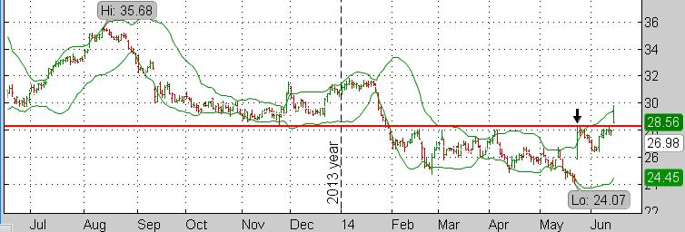
This is an example of when NOT to buy a stock that penetrates an upper Bollinger band. The red line marks overhead resistance. If you buy such a stock, you must consider the consequences if the stock cannot break through that overhead resistance.
In the above chart, note the red horizontal line. It marks the approximate level at which the stock encountered resistance on a number of attempts to rise (in February, March, April, and May). It was support in November. Whether it is support or resistance depends on whether the stock is above or below the line respectively. It is “resistance” when people are selling at that level. When they unload their shares, the price per share drops. Some beginning traders will spot the Bollinger band squeeze and the subsequent close above the upper band (see the black arrow). They will buy without paying attention to the overhead resistance of the red line just above the closing price on that day. Then, after buying, they wonder why the stock did not keep climbing (it collapsed under the selling pressure after the signal). Later, it tried to break through resistance again, and made it. The last price bar shows the price gapped up over the red line. [Note: The Bollinger bands are much closer together in March, April, and May, than in February. The “squeeze” is a bit irregular during that time, but it is nevertheless a 3-month period of relatively low volatility]
Before you buy a stock, always look for potential trouble. Search for overhead resistance if you are a buyer or support (below) if you are a short seller. Before you buy, find any resistance and assume that the stock is not likely to climb above that resistance. The distance from the purchase price to the resistance is your potential gain. The distance from the purchase price to your stop loss is your potential loss. Disciplined traders always have a stop loss, because it defines and limits the downside risk. Undisciplined traders do not like to pre-determine downside risk. Therefore, they tend to lose much more if they are disappointed. The disciplined trader always determines in advance how much he is willing to lose if he is disappointed.
Other remarks about the timing of a purchase.
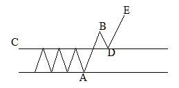
The diagram below shows a common breakout pattern. The breakout occurs when the stock rises above the horizontal line labeled “C.” The stock rises to point “B.” Reaching point “B” may take a day or two. Sometimes it will keep rising, but often it will decline to “C” again, touching “C” at “D.” The trip from “B” to “D” will likely take a day or two, and sometimes three. At that point, it is testing support at “D.” If it is a false breakout, “D” will not hold and the stock will drop below the line labeled “C.” That is why many experienced traders wait to see if the stock rebounds off of line “C” before buying. They want to see evidence that support at point “D” is holding. Once they have confirmation that support is holding, they buy. First, they note the breakout stocks, Then they put them on their “watch list” to monitor them a few days to see how the breakouts are evolving. The people who buy on the breakout take on the added risk that the breakout may be a fakeout. If the pattern of the stock is enticing enough, and if they really want to own this particular stock, they may decide that buying on the breakout is worth the risk (if the stock is strong enough there may be no pullback and the trader will have to enter at a higher price). The tradeoff is the assumption of greater risk for potentially greater profit. A “fakeout” is when, after surging to “B” in the diagram, the stock reverses and plunges below “D.” The reason this happens has been explained above in the paragraph “Breakouts, Gaps, And Other Signals.”
 The same concept applies to crossover signals and other types of alert. For example, experts often watch a stock for a few days after the crossover event to determine if it is a whipsaw or if a follow-through trend commences.
There is much more about risk control, risk strategies, and stop losses on this site.